Wednesday 9 December 2009

Feedback of First Draft

Feedback


After creating my first draft on my front cover, I was able to get feedback from my media teacher. From getting feedback, I was able to change my front cover slightly, which included re-arranging the coverlines on the left hand side as well as changing the issue number and the dateline which is on the top right hand third, so then customers are able to read it. I also made sure that all my information were aligned, so then it looks more realistic and eye-catching.

Music Magazine First Draft


As this is my draft, I have editted this in many different ways as I placed the Masthead on the top of the front cover, with the selling line just above it on the left third. Whereas, on the top right third, I have inserted the date and the issue number.

For the masthead, I was able to insert a white backdrop, with the masthead being blue. I then added four cover lines which relates both to my magazine as well as my genre of R&B. The main heading will be bigger than the other cover lines, as this is the main header which will attract readers to buy this magazine. I have also added a barcode on the bottom left hand corner as this is a main convention in which all magazines have.

Monday 7 December 2009

Music Magazine First Draft


I first opened the image of Taiena and Abi. File > Blank New Window > Adjusted the size to ‘A4’ > Clicked on the image of Taiena and Abi > Select > All > Copy > Paste on a White Document on Adobe Photoshop
I then noticed that the image was a bit too small for A4. To fix this, I held onto the ‘shift’ button and resized the image. I held onto the ‘shift’ button to make sure that my image doesn’t distort.

Edit & Enhance Image
Firstly, the image which i opened, i first duplicated the layer, by right clicking on layer 1 > supplicate. I then used the spot healing tool. I used this tool to remove any spots or blemishes from these two models. After doing this, I then clicked on Filter > Gaussian Blur > 8-9 Pixels. After doing this, i used the rubber tool to rub out what i wanted to be shown clearer. I used this tool so then both models would stand out more than the background and the audience will mainly focus on them. After this, i then changed the layer to Luminosity to give a more blurred effect on the background and made it 100%.

After editing my magazine, I started creating. I started creating my music magazine, by also looking back to my original mock up of this. The mock up helped me as I was able to already know where everything was placed as well as knowing the cover lines, so then I would not be stuck on it further down. I started creating the masthead first. On the masthead, I used a backdrop of the colour white. I have decided to choose the colour white and blue as these are the two main colours that my models are wearing. To create a backdrop, I first duplicated my layer, then coloured it in, in white, and then dragging the copied layer under the original layer on the right hand side. I then used the arrow keys to play around and created a deep backdrop. When down this, I was told it did not look right, so I changed it and toned it down a bit.

Afterwards, I did my selling line and my issue number/dateline. This is placed above my masthead, as I decided that it looked better and more attractive. I then started on my main cover line, which relates to both of models, to give model credit. The main cover line was about an interview between the two models. I then started creating my other cover lines which were placed on the left side of the left third. I stuck to the colour scheme of blue and white, to match my models. To stay with a main convention, I needed a barcode. For this, I looked on Google, to find one and copied and pasted this on my magazine. I resized it and held onto ‘shift’ so then my image doesn’t distort. I then rotated it 90’ anticlockwise and placed it on the bottom right tin the right third. Afterwards, I inserted a text box, and wrote £2.60, as this is how much I am pricing my music magazine. I then rotated this and placed it on my barcode.

Finally, I used the grid by clicking on View > Grid, to left aligned all my cover lines including my selling line to the left and right aligned the issue number/dateline and the main cover line including the explanatory text and the barcode to the right. I have done this, so then it will look more professional and will be easy to read for the readers.

Wednesday 2 December 2009

Photoshoot Plan

Photoshoot Plan


After creating my mock-up of my music magazine. I started creating a photoshoot plan of my main cover image. From my photoshoot plan, I have decided to use two females, which will be a mid shot of them from the waist and upwards. I will also shoot these images outside and make sure I take a couple of images, so then I can choose which one will suit my music magazine.

I decide to chose Abigail and Taiena to be my female models, due to the fact they will be representing my music magazine to the potential audience. The models will be a mid-shot which will be taken outside, therefore, there will be natural lighting. Thus, if needed, I will be able to edit the image on Abode Photoshop.

Music Magazine Mock Up

Music Magazine Mock-Up


After analysing both magazine, I created a mock up of how my music magazine will look like. I have decided to have the masthead at the top, with both selling line and the issue number/dateline above the masthead. I have also decided to have four cover lines which will be on the left side on the left third and have the main cover line (which is about the models in the main cover image)on the right side on the right third. A main convention which I will stay the same is the barcode which will be on the right side on the right third at the bottom.

After creating my mock up, I have decided to name my music magazine 'Flava' and have the selling line as 'The Voice of R&B' I have also decided what my cover lines are and what my main cover line. I have written these on the third slide on this presentation.

I was able to show where I will put my main image, which will be placed in the middle, as well as having four cover lines on the left third, so then readers are able to see what the magazine features and what there is.

Tuesday 24 November 2009

Music Magazine Analysis Two

Music Magazine Analysis Two


In this powerpoint, I labelled and analysed another music magazine called 'Rolling Stone.' In this presentation, I labelled the important points of a magazine and analysed it. I labelled the key terms and conventions of this music magazine. In this analyse, I wrote on each slide, the key terms and why I liked it. I then had a sepearate slide on why I don't like this music magazine.

For the masthead, I found that the name of the magazine 'Rolling Stone' stood out, due to the fact that the masthead was behind the model. As well as that, the masthead stands out as well as the coverline and the model, because of the black and white coloour scheme. Furthermore, the cover lines all relate to music artists and uses indirect language and uses formal language as it is presented in a formal and presentable way.

As you are able to see, I was able to label the main conventions which were inlcuded in a music magazine. I wrote about each key convention, and discuss the eye flow, the mode of address and the register by looking at the front cover.

Sunday 22 November 2009

Music Magazine Analysis


In this powerpoint, I labelled and analysed a music magazine called 'NME.' In this presentation, I labelled the important points of a magazine and analysed it. I labelled the key terms and conventions of this music magazine. In this analyse, I wrote on each slide, the key terms and why I liked it. I then had a sepearate slide on why I don't like this music magazine.

For the masthead, I found that the name of the magazine 'NME' stood out, and was unique due to the font and the colour scheme of the whole magazine. In this magazine, there was a variety of artists on the front cover, which could be a advantage as well as a disadvantage, as many readers will be interested however, some readers may not know all the artists and may dislike them. Overall, the magazine is unique and looks attractive and connects really well with the colour scheme.

However, there is a reason why I don't this magazine, is because the layout looks too random and too bold to look at.

On the analysis, I was able to label all the main and key conventions which I will use on my music magazine; as well as being able to write about each of the key convention. I also talked about the eye-flow of the front cover, as well as the mode of address and the register.

Wednesday 18 November 2009

Mood Board

R&B
Rhythm & Blues


After creating my bar charts and comparing them with each other. I have decided to use the information which I have gathered. Overall, I have decided to create a R&B music magazine, as many of the students are into R&B other than Rock or Pop.

For this, I have created a mood board. The reason on why I have created a mood board about R&B, is so then I get a general idea on what the music magazine will look and feel like. A mood board is a collection of images or words that describe what you are doing. As I am doing R&B, I have gathered images of R&B artists, both male and female. As well as that, I have written down the audience which may be attracted to this music magazine.

By creating this mood board, I am able to find out information about R&B music, and things which are related to this. This will then help me create my music magazine; thus be able to attarct my target audience.

Music Magzazine Questionnaire Overall Feedback

Initial Research Feedback


After getting the 20 students filling in the questionnaire which I had created for my research, I looked over their feedback and created bar charts of them, so then I will find it easier to compare results and find out what was popular from each 8 questions which I wrote on the questionnaire.

The first thing which I did, was that I updated all the results on the computer by using Microsoft Excel. On Microsoft Excel, I was able to highlight the information which I wanted, and created a bar chart. As you can see, I have created 6 bar charts (Question 1,3,4,5,6,7) as these were all closed questions. On Question 2 and 8, the questions were open so then students had to write in relating to the question. After creating all bar charts for the questions which I needed, I then copied them and pasted them on individual slides on Microsoft Powerpoint.

On Microsoft Powerpoint, I was able to make the bar chart more bigger, so then it is more clearer and easier to read the bar charts. After resizing all bar charts, I added a text box underneath them and wrote a little summary of what I had found from each question and how it might relate to my music magazine when I start to create it. For question 2 and 8, I wrote out all the feedback which students gave, so then you are able to see what the students had written for these 2 questions.

Finally, I presented the presentation in an orderly way so then it will be clear and easy for you when reading.

Music Magazine Results Uploaded

Results


As you can see, after giving out my questionnaire to 20 students, I started uploading the information on the computer. The software which I used was Microsoft Excel. I have used Microsoft Excel, as I am able to create bar charts, so then I can compare the data which I recieved.

In Microsoft Excel, I first wrote out all of my information onto charts and wrote how many students ticked each box. After doing all of these for the 6 questions (as two were open questions) I was able to highlight them, and click on the bar chart at the top toolbar. I then followed the instructions and added a title, and labelled the x and y axix. I did this for all of the questions.

Wednesday 11 November 2009

Music Magazine Questionnaire

Inital Reseach


In this lesson, we were asked to create a questionnaire which we will give to at least 20 students to fill in. This questionnaire was created so then I get an overall feedback on what students like listening to, what their favourite artists are etc... This research will then help me when creating my music magazine as I will know what the students like and which is more popular and efficient for my music magazine. Here is a sample of my questionnaire.

I was able to create eight questions, in which I think will relate to me finding out who my target audience is. I asked many questions which will help me find out what type of music magazine people are looking for.

I asked the questions;

1. What type of music do you generally listen to?
I gave the options of four genres (R&B, Rock/Pop, Hip-Hop and Grime) which the participants where able to choose from.

2. Who is your favourite artist on the chosen genre above?
This is an open questions in which particpants are able to write which artist is their favourite.

3. Which colour scheme do you prefer?
I gave the particpants the choice of 6 colour schemess, (Red/Black/White, Blue, Pink, Green/Purple/White, Black/White and the option of other).

4. What type of article would you like to read?
This is a closed question, so then particpants will have to choose rather than them writng down what they like. I gave them the option of interviews, articles and cd review/music fashion.

5. Would you like this magazine to be?
This is also a closed question, giving the chose of weekly, fortnighly and monthly.

6. How much would you spend on this music magazine?
This is also a closed question, which particapnts can choose over £2.20- £2.60, £2.70-£3.10 and £3.20 +.

7. What font do you prefer for the Masthead on the front cover?
I gave the particpants the options of different fonts which inlcudes six different fonts.

8. What would be your most preferred magazine name based on the chosen genre above?
This is an open question so then participants are able to write what they would like as the music magazie masthead.

Project Plan

Project Plan


This is a project plan, on how I would set out my time efficiently when creating my music magazine. On this project plan, this shows how I will manage my time. I will first start by gathering research about music magazines in order for me to reach my target audience and identify who they are. This will then be followed by analysis about the questionnaires which I conducted. I will also analyse two exisiting front covers so then I get a overall idea of how front covers look like. From, looking at these two analysis, I will be able to mock up a front cover for myself. This will then get as many drafts as I need in order to make it look more professional and eye-catching to my target audience.

After the christmas holidays, I analyse two exisitng double page spreads and create my one. By analysing two existing double page spread, I am able to see what they are and what the audience are more likely to read. By condcuting my questionnaire, I was able to find out that my target audience are more interested in reading an interview rather than a music review. THis is then followed by me analysing two exsiting table of contents, so then I am able to get an overall feel on what they are and what they consistent of. By doing this, I will create my own table of contents, by adding images and information about the magazine, to make it look more realistic and eye-catching for the target audience.

After the half term, I will product many drafts of both my table of contents and double page spread, in order to make to my own standards. After this, I should be in the beginning of March, where I will be able to create final drafts of all three, tabel of contents, double page spread and front cover. This is then followed by my evaluation of my presentation which will be a powerpoint presentation.

Thursday 5 November 2009

Final Magazine Contents Page

Final Magazine Contents Page


This is the final copy of my magazine contents page. From the other draft, I have made a few changes. One of the changes which I have done was that I deleted the 'Contents' as my teacher Mr Lau, suggested this as well as the readers will automatically know what the page is. Another change that I made, is I moved the selling line a bit to the right to make it look attractive and eye-catching to the readers. As well as that, I have moved all of my text more up and have spaced it out more equally to look more professionally towards the readers.

Afterwards, I have inserted the four images which I had taken before, which relates to my sub-headings. I inserted them by first opening up the pictures and one by one copying them and pasting them on the contents page. I have decided to out the image of the Sixth Form Building first, as this is about the 'Cover Story.' For this image, I editted this, as I saw some people on the far left hand side. To take them out of the picture, I used the 'Clone Tool' and held onto the 'shift' button and deleted what wasnt appropriate for this image.


As you can see, there were people in the image, so I editted them out.

I then decided to use the image of the sixth formers working as this relates to 'School Life' and how students can achieve the best results. Next, I chose to put the image of the sixth formers looking at the Blandford Street plaque as this connects to the sub-heading of 'School Events' and how the opening of the building was a success. Lastly, I put the image of the students playing sport on the bottom right hand corner on the right third, as the 'Sports' section was the last sub-heading and closely related to the picture inserted on the right.

Furthermore, after I had finished inserting the images, I wrote down the page numbers of each photo which it represents. For the Sixth Form Building, th page number was 3. The sixth formers working was page 11, the plaque was page 13 and finally the sports page was page 17.
To create these, I used the font 'Monotype Corsiva,' size 48pt' and 'Bold' so then it will look attractive. I first used the colour purple, but then I found out that it doesn't look eye-catching enough. To imrpove this, I used a backdrop of the colour white on all of the page numbers.

Finally, the last thing which I did, was put the actual page number of the contents page. As you can see as the bottom right hand corner in the right third, I have written 'page 1' as this is the first page. This is in the same font as the main pages which is 'Broadway,' and used size '11pt.' I also did it in 'Bold,' 'Regular' and the colour 'Black' so then it still sticks to the colour scheme and will look more clearer and eye-catching to read. I have also done all these changes and improvements so then the readers will find it easier to read and understand what the magazine contains.

Wednesday 4 November 2009

Magazine Contents Page

This is a first draft of how I have started off creating my magazine contents page.


I have first started off creating all my text.

Masthead
For the Masthead from the front cover, I have used the same font 'Champagne and Limousines' to make it look the same as the front cover. However I have used a smaller size, as I have used size '90pt.' It is also in 'Regualar' and 'Bold' to make it satnd out. I have also used a backdrop of this, so then it will look exactly the same as the front cover by in a more smaller version. I have used a backdrop of the colour purple behind the black text. I then put the Masthead of the magzine name in the middle of the page.

Selling Line
For the selling line, I decided to put this is as well, because I believe a masthead isn't complete without a selling line underneath it. I also decided to keep it the same, with the font 'Lucida Calligraphy' and size '14pt.' I also put it in 'Italic,' 'Bold' and the colour 'Black' to make it look the same as before. I also placed the selling line in the middle, underneath the masthead.

Contents
I then wrote 'Contents' and placed it, in the same place as the masthead and selling line, but underneath, so then readers are aware of what the page is. I decided to use the font 'Broadway' and size '36pt' to make it stand out for the readers. I also chose to do it in 'Regular,' 'Bold' and the colour 'Black.' I have chosen all of these as I find that it will be much clearer and easier for the readers to read.

Main Headings
For the main headings such as: 'Cover Story, School Life, School Events, Sports,' I have decided to use the font 'Broadway' again and size '22pt.' It is also in 'Regular,''Bold' and the colour 'Black' to make it stand out and appeal to the audience. For these main headings, I have chosen to use a backdrop of the colour purple. I have carried on the purple theme, so then it connnects with both my magazine and my model on the front cover.

Sub-Headings/Page Numbers
Moreover, for the sub-headings and the page numbers from the contents page, I decided to carry on using the same font 'Broadway' but when down in size to '15pt' as it was not that important as the main heading but still is. Its also in 'Regular' as always,'Bold' to make it stand out and the colour 'Black' to make it readable and clearer.

Information Given
Underneath most of the sub-headings, I have written a short sentence about the sub-heading or what the magazine contains. For this, I have especailly changed the font to 'Monotype Corsiva' and to size '10pt' as I think it will look more attarctive and will stand out from the rest due to the different font used. I have chosen to use a backdrop of the colour purple. I have carried on the purple theme, so then it connnects with both my magazine and my model on the front cover and carries on to the contents page.

Lines
Lastly, I have placed in lines sectioning each sub-heading, so then readers will not get confused. For the line, I have used the font 'Broadway' and the size '10pt' as it connects with the other text on the page. I also carried on the colour scheme by using the colour purple to connect with both the front cover and the text which I have created so far on the contents page.

Four Images Taken

First Image
Sixth Form College in Blandford Street


Second Image
Group of Sixth Formers Working


Third Image
Two students Looking At The Blandford Street Palque


Fourth Image
Students Playing Sport


As I took this photo's, I took into consideration about the lighting and the steadiness of my hand when taking them. As you can see I have taken these pictures all without flash and used the natural lighting.

After taking these photo's, I did not make any major corrections. However, on Adobe Photoshop, I used my ability of the 'Clone Tool' to take away people on the far left hand side on the pathway, behind the college. I decided to take them away as they looked a bit random on my Sixth Form image.

Planning My Four Images

Planning My Four Images


From looking above, we were asked to fill in the this table after we had created our plan for the contents page. This table was generally a plan on how we would shoot our images which we are going to use in the contents page. In my contents page, I decided to have at least four images, as I think having more than this, will make the contents page look too complicated and would not look eye-catching.
The four images which I have decided to take, relates overall to my sub-headings.

1. I would have a portrait image of the new Sixth Form building at Blandford Street (This relates to my 'Main Cover Story')
2. I would then have another portrait image of 3 sixth formers in an ICT room, doing work.
(This relates to my 'School Life' sub-heading)
3. I would then have another portrait image of two sixth formers next to the Blandford Street plaque.
(This relates to my 'School Events' sub-heading)
4. Lastly I would have a portrait image of a group of secondary students playing sports.
(This relates to my 'Sports' sub-heading)

I have closely taken into consideration about my four images and making sure that they all relate to the magazine sub-headings. I decided to have the first left images on the left hand side on the left third, underneath each other, whereas the last image will go on the right hand corner at the bottom right third.

Contents Page Plan

Contents Page Plan


After creating our magazine cover, we were told we had to plan out our contents page for our magazine. As you can see above, I layoured out my plan specifically as I put things where I wanted everything to be. I decided to have the main masthead from the front cover 'Aim High' and the selling line 'be where you wanna be,' to put on the contents page so then readers will know what the magazine is called. As I had decided to put 'Contents' as my main masthead so then readers will know what this page is about. Theremore, there are four images to relate to my sub-headings which are: Cover Story, School Life, School Events and Sports.

Improvement

Improvement


The improvement which I have done to change the magazine was that I changed the selling line. I changed it to 'be where you wanna be,' from 'and be where you wanna be.' I decided to take out the word 'and' as this was a negative feedback which I had got who told me that the selling line would be more in-depth and focused more by taking out the word 'and.'

Friday 16 October 2009

Improved Magazine Cover

Improved Magazine Cover


I improved the Masthead by having a backdrop behind the actual Masthead. I used the colour purple to put behind the text in black to make it connect to Melissa’s clothes. Also I did this, to make the Masthead more appealing and eye-catching to look at.

To improve this magazine, I improved a lot on the main Kicker, by changing the colour from white to black. I did this because it was unclear and hard to read on a blue background from the feedback which I got. I changed the colour to black and also included a backdrop of the colour purple to match Melissa’s clothes. I chose to do to make the text relate to what Melissa is wearing and connect together.

For the explanatory text under the Main Kicker, I aligned this to the right as this is what makes the eye order, from left to right. To also make it attractive I have changed the colour to black instead of white, due to the feedback which I got back. Finally I included a backdrop of the colour white, as white and black both connect and make the text stand out more.

I also improved my magazine by using a grid. I used a grid to align both my kickers on the left hand side. I have aligned the kickers on the left hand side, to make it look more professional as well as eye-catching for the audience. As you can see ‘This’ is aligned with ‘Read’ and ‘Decade.’ And ‘your’ is aligned with ‘Outbreak.’ This makes it more simple and clear to readm for the target audience.

I also improved the explanatory text under the third Kicker. I did the same thing by using the colour white, to make the text stand out more. As well as this, I have also completely changed the text colour from white to black, so then it will be easier for the audience to read. As well as that, the backdrop colour which I used was white, to make it readable and clear.

I also improved the explanatory text under the second Kicker. I used the colour white, to make the text stand out more. As well as this, I have completely changed the text colour from white to black, so then it will be easier for the audience to read. I also had a backdrop of the colour white to make it more appealing to the readers.

Backdrop Shadow
To have a backdrop shadow on my text, I first duplicated the layer which contained the text which I wanted a backdrop on. I then choose by colour by using the 'Eyedropper Tool,' I used this tool to get the exact and precise colour of Melissa's clothes, I decided to choose the colour purple from her top. I then used the 'Horizontal Type Tool' to highlight the text and clicked on the colour palette at the bottom left hand corner. There, it should have auotmactically changed the colour which you have chosen (Mine would have been the purple from Melissa's clothes, then click it and click 'Ok.' After this, move the duplicate layer on top of the original layer. By doing this it will put the duplicate layer of purple behind and bring the 'black' text at the front. I then clicked on the 'black' text and moved it around by using the left and right buttons on the keyboard to give a backdrop shadow behind the text.

Magazine Feedback

Magazine Feedback

This is a powerpoint presentation where I typed up feedback. After I created my first draft of my magazine cover, I went over my class and found three people to give me feedback about what they liked about my magazine and what they disliked about it. I choose to ask, Melissa, Sonia and my Media teacher Mr Lau.

All three respondents gave me postive feedback as well as some negative feedback. Moreover, from this they also gave me feedback on how to improve my magazine cover.
I took these comments into consideration and improved my magazine.

Magazine Evaluation

Magazine Evaluation


This is an evaluation of my magazine which Mr Lau had told us to do. In my evaluation, I briefly discussed the differences and the similarities of both my magazine and a real media magazine. I also talked about where I would distribute these type of magazine and who the target audience is. Also I discussed how did I attract my audience and finally what new technology techniques I learnt when creating my magazine front cover.

First Draft of Magazine

First Draft of Magazine


After following my plan I found I had to make some slight changes such as moving the dateline to the left hand side of the magazine to make it look more attractive and appealing to the audience. I have also changed the size of the Masthead to ‘147pt’ and the font to ‘Champagne and Limousines.’ Furthermore, I changed the font of the selling line to font‘Lucida Calligraphy' and size ‘18pt.’ I have done this so then my magazine will look interesting and will stand out more. I have also changed the selling line to 'Italic' to make it look more eye-catching and unique. Moreover, I changed the two kickers into different fonts and sizes. I used size ‘38pt’ for the Kicker and font 'Eurofurence Light.' I also changed the explanatory text font into ‘Eurofurence Light’ as well and the size to ‘30.’ Lastly, the main Kicker and explanatory text changed as I thought of a more successful Kicker which will encourage students to read this magazine, as well as changing the font to ‘Copperplate Gothic Bold’ and the size to ‘48pt’ to make it stand out. I also changed the explanatory text to size ‘30pt’ and the font to ‘Eurostile’ to make it more eye-catching. Finally, I had changed it originally from black to white, so then it would stand out on the magazine.

I also changed the background colour to blue, to represent a connation of the blue sky. I did this by adding a new layer > using the palette colour to choose my colour > then I used the ‘Fill Tool’ to fill in my background. I chose the colour blue, as I believe it is a unisex colour and that it appeals to both males and females.

After this first draft I will need to evaluate and receive feedback in order to see what needs to be improved.

Before & After Image of Melissa

Before


After


After I uploaded my main image for my magazine cover onto the computer I started to edit my image to make it more appropriate for my magazine cover.

I needed to make sure my image was the size of ‘A4’ for the magazine cover. I first opened the image of Melissa. To change the size, I went to File > and opened a ‘Blank New Window > Adjusted the size to ‘A4’ > Clicked on the image of Melissa > Select > All > Copy > Paste on a white document

I then noticed that the image of Melissa was too small and had a lot of white pace around her. Therefore, I held onto the ‘shift’ button and resized the image. I held onto the ‘shift’ button to make sure that my image doesn’t distort. After I fixed this, I started to edit my image.

Edit & Enhance Image:
Firstly, the image which I had, I duplicated the layer. I did this by right clicking on the layer and clicking ‘duplicate.’ Then I used the ‘Spot Healing Tool’ to take away spots or blemishes. Following on, I then clicked on Filter > Blur > Gaussian Blur > and choose around 4-5 pixels which were around 2.7. After this, I used the ‘Rubber Tool,’ to take away any distinguishing features to make it stand out more. I used the ‘Rubber Tool’ on Melissa’s folders and her eyes and hair.

Secondly, I adjusted the lighting by clicking on Shadows/Highlights. I changed the shadows and increased the mid tone to make the lighting more realistic and effective.

Finally, to take away the shadow behind Melissa, I clicked on ‘Magnetic Lasso Tool’ and went around the image which I wanted to keep. > Select > Inverse > (On Layer 1 Copy) > Delete > (Layer 1) > Delete > Esc Key. I have done this to make Melissa stand out more and look more visual and clear. I also used ‘Hue/Saturation’ to adjust the colour of the image to make it look more appealing to the audience.

Before - Image Of Melissa


When learning new and developing existing skills of media by using Adobe Photoshop, we we learnt about the different techniques of a successful magazine cover. We now had to take pictures of our main cover image. I arranged for my friend Melissa, from the same Media Studies class to go out and take pictures of her in front of a white background inside of the Sixth Form Building. We did this during the media studies lesson. I had asked her to look sideways and slightly look at the top. I also told her to hold her bag, and folders/books to look like an ordinary student. As well as that, I told her to smile to make it look like she is happy and that education is the best thing.

Layout Of Magazine Cover

Layout Of Magazine Cover


As you can see, before I made my magazine cover, I had to plan out where I would put the important key things on the magazine and have a rough idea what I should put there.

Dateline:
The dateline is on the left hand side and is above the Masthead. I have decided to put the dateline there, as it is important but not that much. I have written on the layout that I would use the font 'Arial' and size '22pt.'

Masthead:
The Masthead will be 'Aim High.' This will be written in 'black' and size '60pt.' I decided to put the Masthead at the top of the magazine so then it will be easier and clear for the audience to read.

Selling Line:
The Selling Line for this magazine will be 'And be where you wanna be...' I have decided to incorporate the word 'you' so then it will persuade and attract the students. This will be size '20pt,' font 'Arial' and will be in 'Italic.'

Main Image:
The main image of my magazine will be Melissa. I have decided to give Melissa a sideways pose, while she was holding, books, folders and maybe her bag. She is aldo smiling to give a good impression of the education.

Main Kicker & Explanatory Text:
The Main Kicker and Explanatory Text will be under the main image on the right hand side. I have decided to put this on the right hand side so then it will follow the eye order of the students (reading from the left to the right hand side of the magazine).

Kicker & Explanatory Text:
On the left hand side of the magazine, I will have another two kickers with explanatory text. I will make sure that the kickers will be relevant and relate to students as this is a student magazine.

Thursday 15 October 2009

Mode Of Address

In the following Media Lesson, we were taught the different Mode of Addresses/Language.

Mode Of Address:
Direct
When the magazine text is speaking to you, by using words such as 'your' or 'you.'
For Example: 'You Know You Love Her,'

Indirect
When the magazine is not speaking to you such as words like 'all.'
For Example: 'Spring Forward All The Trends From A to Z,'

Register:

Formal
The text which is written in a more presentable and formal way.
For Example: 'The Big M,'

Informal
The text contains a little bit of slang.
For Example: 'Spin A Passion Into Big Bucks,'

Colloquial
The text contains exteme slang.
For Example: 'This Ain't Nothin Without Youths'

Inclusive
The text where everyone can think about this particular topic, by using the words 'your' or 'you.'
For Example: 'Your Most Stylist Summer,'

Exclusive
The text where it only applies to certain groups.
For Example: 'Mortifying 1st Day Of School Memories,'

Planning My Front Cover Image

Planning My Front Cover Image For My Magazine


Before, creating my magazine, I have to plan out my front cover image. I have chosen to take a picture of my friend Melissa. I have taken a mid-shot image of Melissa from her waist and upwards. I have decided to either take the picture on a white background or outside the Sixth Form College, to give the representation of education. Also, I have decided to give the image a natural look by using natural lighting inside or outside the building. The mise-en-scene will consists of Melissa holding books, folders, bag and wearing everyday college clothes. The attempted connation which I will hopefully make is education, school, future. Wheread the planned denotation will be Sixth Form College, sky and everyday life.

Analysing Pictures

Analysing Pictures

After learning about different fonts, we were taught how to analyse images. In the lesson we learnt about the ‘Mise-en-scene’

The definition for ‘Mise-en-scene- is everything in the frame that helps us tell a story.

We also learnt about the Denotation and Connotation of an image.

Denotation: Anything that we can see in the image
Connotation: Anything that represents the image


For example:
This is an image which Mr Lau had shown us. The image is of a girl jumping in a park.

The Denotation of this is:
The girl jumping, the green grass, blue skies and the trees in the background.

The Connotations of this is:
The girl is feeling either happy or excited. We can see this as the girl is jumping with a smile on her face. The girl is also wearing dungarees to show that she represents youth and that she is proud of this. It also represents a lively atmosphere and a normal reaction to this.

We also learnt about different shots.

The shot and angle which the image is, is a long shot and a slightly low view angle so them we can see the girl. This image is idyllic due to the colours being used in the image. We can tell that this is a long shot, as the girl is occupies ¾ to 1/3 of the screen height. This is also a slightly low view angle as we are slightly looking up to the girl.

Different Fonts

Different Fonts


In our media lessons we learnt about different types of font we could use when creating magazines, posters etc...

Serif font (Times New Roman)
These types of fonts are usually used for large blocks of text. For example: the main body of a newspaper. Also it is easier to read. Ligatures are the curves at the end of each letter. Ligatures are curlicue or embellishments at the end of strokes.

A sans serif font (Arial)
These types of fonts are used for signage for large headline, adverts, small amounts of text. These make the text also stand out. A sans serif font, is without ligatures

A script-style font (Freestyle Script)
These types of fonts are used for elaborate adverts. It is more personal and more elegant. These are orginally modelled after fountain pens.

A decorative font
These types of font are used for few words, so they can add emphasis on a special heading or caption.

Tuesday 6 October 2009

Before & After Model Image

Before


This was the actual picture of the model, before I started editing her on Adobe Photoshop.

After


In Adobe Photoshop, we were taught how to change the apperance and imperfections of pictures. I choose this model photo and edited her by changing her eye colour and many more. The first thing, which I did was right clicked on the layer and duplicated it. Once I duplicated the layer, I clicked on the 'Spot Healing Tool' and then went to Filter > Blur > Gaussian Blur > 4-5 pixels. I did all of this, to make her skin look more smoother and more realistic. Into the new layer, which I duplicated, I then clicked on the 'Rubber Tool' and erased out her eyebrows, eyes, eyelashes ans lips to make it look more bolder and make it stand out.

To change the model's eye colour, I clicked on the 'Standard Brush' and made the size of the circle brush the same size as her pupils. I did this, by dragging the scale at the top toolbar at the top to change the size of the circle. Once I found the exact size, I created a new layer and then selected the colour which I wanted for her eye colour, by changing the colour from the 'Colour Palette' at the bottom left hand corner. Then I clicked on both eyes. Afterwards this looked a bit weird as it didn't look real. I changed this by changing the light to 'Soft Light' and decreased the opacity to make it look realistic and for it to blend in.

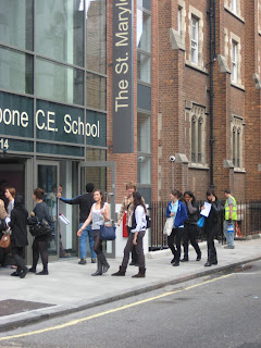
St Marylebone School Cloned

St Marylebone School

Before


This was the original photo of the St Marylebone Sixth Form

After


This is the photo which I had edited. I edited this photo by using the tool button 'Clone Tool.' I first opened this image of St Marylebone Sixth Form. I then clicked on the 'Clone Tool' button, and then held onto the 'alt' button and clicked on whatever I wanted to clone. By doing this, it made the image clear out and duplicate it. As you can see, I have cleared out the St Marylebone Sign on the side, by using the 'Clone Tool.'

Monday 5 October 2009

Photoshop Editing

Before


This was the orginal photo that we, as a group, took of Jade for a magazine cover.

After


This was after we had taken the picture and played around with Adobe Photoshop. In Adobe Photoshop, I did alot of things to create this piece. I first open my image of Jade and edited it. I clicked on the new layer on the left hand side and by using the 'Brush Tool,' I was able to colour Jade in with different colours by changing them at the palette on the right hand side at the bottom. After changing and mixing around with colours, I then clicked on filter at the top toolbar and clicked on 'Gaussian Blur' and changed it to around 30-70 pixels, to make the colours which I choose blend in. Afterwards, I clicked on the left hand side and cahnged to 'Normal' to 'Overlay' to make it more emphasised. This was all down on the same layer which I added in the beginning. To get the picture of Topshop, I went on the internet and copy and pasted it on a new layer. To make the picture more bigger or smaller, I held down the shift button and resized it. I then ticked the tick box on the top toolbar to unblur the picture to make it look more professional and eye-catching. To take away all the white area inside and outside the name (Topshop), I used a tool called the 'Magic Wand' to clicked on the area which I want and then selected delete. Finally, I went onto the top toolbar and clicked on filter, adjustments and invert. I did this so then the picture goes from either black to white, or white to balck.

College Magazine Analysis


College Magazine Analysis

In this powerpoint of College Magazines, I compared 2 magaizine covers. I used the 'College' and 'Walk On' Magazine. In this analysis of comparing both magazines, I labelled the key terms. As well as that, I wrote on each slide of the magazine, key points and what I liked and what I hated about both magazines. In both magazines, there was a difference, as I like the 'College' magazine better than the 'Walk On' magazine due to the colours presented on the main image. I liked the 'College' magazine better as I found it more appealing and simple to look at due to the less colour being used. Whereas, I disliked the 'Walk On' magazine, due to the dark colour represented as the background which made it feel more dull and boring to look at. Each magazine had their own flaws.

Heat Magazine Cover


Heat Magazine Cover

The magazine which I used to label and analyse was the Heat Magazine. In this powerpoint, I labelled the important points of a magazine and analysed it. For this, we have to learn important key terms and conventions of a magazine cover. The masthead, I found that it was the name of the magazine 'Heat.' This masthead was original as well as unique as it stood out and was eye-catching to look at for the readers. In this, there are three main images, which is called 'Triptych,' usually magazines have one main image. Heat has three main images on the cover of the magazine, to make it look more appealing and attracted by this.