Friday 16 October 2009

Improved Magazine Cover

Improved Magazine Cover


I improved the Masthead by having a backdrop behind the actual Masthead. I used the colour purple to put behind the text in black to make it connect to Melissa’s clothes. Also I did this, to make the Masthead more appealing and eye-catching to look at.

To improve this magazine, I improved a lot on the main Kicker, by changing the colour from white to black. I did this because it was unclear and hard to read on a blue background from the feedback which I got. I changed the colour to black and also included a backdrop of the colour purple to match Melissa’s clothes. I chose to do to make the text relate to what Melissa is wearing and connect together.

For the explanatory text under the Main Kicker, I aligned this to the right as this is what makes the eye order, from left to right. To also make it attractive I have changed the colour to black instead of white, due to the feedback which I got back. Finally I included a backdrop of the colour white, as white and black both connect and make the text stand out more.

I also improved my magazine by using a grid. I used a grid to align both my kickers on the left hand side. I have aligned the kickers on the left hand side, to make it look more professional as well as eye-catching for the audience. As you can see ‘This’ is aligned with ‘Read’ and ‘Decade.’ And ‘your’ is aligned with ‘Outbreak.’ This makes it more simple and clear to readm for the target audience.

I also improved the explanatory text under the third Kicker. I did the same thing by using the colour white, to make the text stand out more. As well as this, I have also completely changed the text colour from white to black, so then it will be easier for the audience to read. As well as that, the backdrop colour which I used was white, to make it readable and clear.

I also improved the explanatory text under the second Kicker. I used the colour white, to make the text stand out more. As well as this, I have completely changed the text colour from white to black, so then it will be easier for the audience to read. I also had a backdrop of the colour white to make it more appealing to the readers.

Backdrop Shadow
To have a backdrop shadow on my text, I first duplicated the layer which contained the text which I wanted a backdrop on. I then choose by colour by using the 'Eyedropper Tool,' I used this tool to get the exact and precise colour of Melissa's clothes, I decided to choose the colour purple from her top. I then used the 'Horizontal Type Tool' to highlight the text and clicked on the colour palette at the bottom left hand corner. There, it should have auotmactically changed the colour which you have chosen (Mine would have been the purple from Melissa's clothes, then click it and click 'Ok.' After this, move the duplicate layer on top of the original layer. By doing this it will put the duplicate layer of purple behind and bring the 'black' text at the front. I then clicked on the 'black' text and moved it around by using the left and right buttons on the keyboard to give a backdrop shadow behind the text.

Magazine Feedback

Magazine Feedback

This is a powerpoint presentation where I typed up feedback. After I created my first draft of my magazine cover, I went over my class and found three people to give me feedback about what they liked about my magazine and what they disliked about it. I choose to ask, Melissa, Sonia and my Media teacher Mr Lau.

All three respondents gave me postive feedback as well as some negative feedback. Moreover, from this they also gave me feedback on how to improve my magazine cover.
I took these comments into consideration and improved my magazine.

Magazine Evaluation

Magazine Evaluation


This is an evaluation of my magazine which Mr Lau had told us to do. In my evaluation, I briefly discussed the differences and the similarities of both my magazine and a real media magazine. I also talked about where I would distribute these type of magazine and who the target audience is. Also I discussed how did I attract my audience and finally what new technology techniques I learnt when creating my magazine front cover.

First Draft of Magazine

First Draft of Magazine


After following my plan I found I had to make some slight changes such as moving the dateline to the left hand side of the magazine to make it look more attractive and appealing to the audience. I have also changed the size of the Masthead to ‘147pt’ and the font to ‘Champagne and Limousines.’ Furthermore, I changed the font of the selling line to font‘Lucida Calligraphy' and size ‘18pt.’ I have done this so then my magazine will look interesting and will stand out more. I have also changed the selling line to 'Italic' to make it look more eye-catching and unique. Moreover, I changed the two kickers into different fonts and sizes. I used size ‘38pt’ for the Kicker and font 'Eurofurence Light.' I also changed the explanatory text font into ‘Eurofurence Light’ as well and the size to ‘30.’ Lastly, the main Kicker and explanatory text changed as I thought of a more successful Kicker which will encourage students to read this magazine, as well as changing the font to ‘Copperplate Gothic Bold’ and the size to ‘48pt’ to make it stand out. I also changed the explanatory text to size ‘30pt’ and the font to ‘Eurostile’ to make it more eye-catching. Finally, I had changed it originally from black to white, so then it would stand out on the magazine.

I also changed the background colour to blue, to represent a connation of the blue sky. I did this by adding a new layer > using the palette colour to choose my colour > then I used the ‘Fill Tool’ to fill in my background. I chose the colour blue, as I believe it is a unisex colour and that it appeals to both males and females.

After this first draft I will need to evaluate and receive feedback in order to see what needs to be improved.

Before & After Image of Melissa

Before


After


After I uploaded my main image for my magazine cover onto the computer I started to edit my image to make it more appropriate for my magazine cover.

I needed to make sure my image was the size of ‘A4’ for the magazine cover. I first opened the image of Melissa. To change the size, I went to File > and opened a ‘Blank New Window > Adjusted the size to ‘A4’ > Clicked on the image of Melissa > Select > All > Copy > Paste on a white document

I then noticed that the image of Melissa was too small and had a lot of white pace around her. Therefore, I held onto the ‘shift’ button and resized the image. I held onto the ‘shift’ button to make sure that my image doesn’t distort. After I fixed this, I started to edit my image.

Edit & Enhance Image:
Firstly, the image which I had, I duplicated the layer. I did this by right clicking on the layer and clicking ‘duplicate.’ Then I used the ‘Spot Healing Tool’ to take away spots or blemishes. Following on, I then clicked on Filter > Blur > Gaussian Blur > and choose around 4-5 pixels which were around 2.7. After this, I used the ‘Rubber Tool,’ to take away any distinguishing features to make it stand out more. I used the ‘Rubber Tool’ on Melissa’s folders and her eyes and hair.

Secondly, I adjusted the lighting by clicking on Shadows/Highlights. I changed the shadows and increased the mid tone to make the lighting more realistic and effective.

Finally, to take away the shadow behind Melissa, I clicked on ‘Magnetic Lasso Tool’ and went around the image which I wanted to keep. > Select > Inverse > (On Layer 1 Copy) > Delete > (Layer 1) > Delete > Esc Key. I have done this to make Melissa stand out more and look more visual and clear. I also used ‘Hue/Saturation’ to adjust the colour of the image to make it look more appealing to the audience.

Before - Image Of Melissa


When learning new and developing existing skills of media by using Adobe Photoshop, we we learnt about the different techniques of a successful magazine cover. We now had to take pictures of our main cover image. I arranged for my friend Melissa, from the same Media Studies class to go out and take pictures of her in front of a white background inside of the Sixth Form Building. We did this during the media studies lesson. I had asked her to look sideways and slightly look at the top. I also told her to hold her bag, and folders/books to look like an ordinary student. As well as that, I told her to smile to make it look like she is happy and that education is the best thing.

Layout Of Magazine Cover

Layout Of Magazine Cover


As you can see, before I made my magazine cover, I had to plan out where I would put the important key things on the magazine and have a rough idea what I should put there.

Dateline:
The dateline is on the left hand side and is above the Masthead. I have decided to put the dateline there, as it is important but not that much. I have written on the layout that I would use the font 'Arial' and size '22pt.'

Masthead:
The Masthead will be 'Aim High.' This will be written in 'black' and size '60pt.' I decided to put the Masthead at the top of the magazine so then it will be easier and clear for the audience to read.

Selling Line:
The Selling Line for this magazine will be 'And be where you wanna be...' I have decided to incorporate the word 'you' so then it will persuade and attract the students. This will be size '20pt,' font 'Arial' and will be in 'Italic.'

Main Image:
The main image of my magazine will be Melissa. I have decided to give Melissa a sideways pose, while she was holding, books, folders and maybe her bag. She is aldo smiling to give a good impression of the education.

Main Kicker & Explanatory Text:
The Main Kicker and Explanatory Text will be under the main image on the right hand side. I have decided to put this on the right hand side so then it will follow the eye order of the students (reading from the left to the right hand side of the magazine).

Kicker & Explanatory Text:
On the left hand side of the magazine, I will have another two kickers with explanatory text. I will make sure that the kickers will be relevant and relate to students as this is a student magazine.

Thursday 15 October 2009

Mode Of Address

In the following Media Lesson, we were taught the different Mode of Addresses/Language.

Mode Of Address:
Direct
When the magazine text is speaking to you, by using words such as 'your' or 'you.'
For Example: 'You Know You Love Her,'

Indirect
When the magazine is not speaking to you such as words like 'all.'
For Example: 'Spring Forward All The Trends From A to Z,'

Register:

Formal
The text which is written in a more presentable and formal way.
For Example: 'The Big M,'

Informal
The text contains a little bit of slang.
For Example: 'Spin A Passion Into Big Bucks,'

Colloquial
The text contains exteme slang.
For Example: 'This Ain't Nothin Without Youths'

Inclusive
The text where everyone can think about this particular topic, by using the words 'your' or 'you.'
For Example: 'Your Most Stylist Summer,'

Exclusive
The text where it only applies to certain groups.
For Example: 'Mortifying 1st Day Of School Memories,'

Planning My Front Cover Image

Planning My Front Cover Image For My Magazine


Before, creating my magazine, I have to plan out my front cover image. I have chosen to take a picture of my friend Melissa. I have taken a mid-shot image of Melissa from her waist and upwards. I have decided to either take the picture on a white background or outside the Sixth Form College, to give the representation of education. Also, I have decided to give the image a natural look by using natural lighting inside or outside the building. The mise-en-scene will consists of Melissa holding books, folders, bag and wearing everyday college clothes. The attempted connation which I will hopefully make is education, school, future. Wheread the planned denotation will be Sixth Form College, sky and everyday life.

Analysing Pictures

Analysing Pictures

After learning about different fonts, we were taught how to analyse images. In the lesson we learnt about the ‘Mise-en-scene’

The definition for ‘Mise-en-scene- is everything in the frame that helps us tell a story.

We also learnt about the Denotation and Connotation of an image.

Denotation: Anything that we can see in the image
Connotation: Anything that represents the image


For example:
This is an image which Mr Lau had shown us. The image is of a girl jumping in a park.

The Denotation of this is:
The girl jumping, the green grass, blue skies and the trees in the background.

The Connotations of this is:
The girl is feeling either happy or excited. We can see this as the girl is jumping with a smile on her face. The girl is also wearing dungarees to show that she represents youth and that she is proud of this. It also represents a lively atmosphere and a normal reaction to this.

We also learnt about different shots.

The shot and angle which the image is, is a long shot and a slightly low view angle so them we can see the girl. This image is idyllic due to the colours being used in the image. We can tell that this is a long shot, as the girl is occupies ¾ to 1/3 of the screen height. This is also a slightly low view angle as we are slightly looking up to the girl.

Different Fonts

Different Fonts


In our media lessons we learnt about different types of font we could use when creating magazines, posters etc...

Serif font (Times New Roman)
These types of fonts are usually used for large blocks of text. For example: the main body of a newspaper. Also it is easier to read. Ligatures are the curves at the end of each letter. Ligatures are curlicue or embellishments at the end of strokes.

A sans serif font (Arial)
These types of fonts are used for signage for large headline, adverts, small amounts of text. These make the text also stand out. A sans serif font, is without ligatures

A script-style font (Freestyle Script)
These types of fonts are used for elaborate adverts. It is more personal and more elegant. These are orginally modelled after fountain pens.

A decorative font
These types of font are used for few words, so they can add emphasis on a special heading or caption.

Tuesday 6 October 2009

Before & After Model Image

Before


This was the actual picture of the model, before I started editing her on Adobe Photoshop.

After


In Adobe Photoshop, we were taught how to change the apperance and imperfections of pictures. I choose this model photo and edited her by changing her eye colour and many more. The first thing, which I did was right clicked on the layer and duplicated it. Once I duplicated the layer, I clicked on the 'Spot Healing Tool' and then went to Filter > Blur > Gaussian Blur > 4-5 pixels. I did all of this, to make her skin look more smoother and more realistic. Into the new layer, which I duplicated, I then clicked on the 'Rubber Tool' and erased out her eyebrows, eyes, eyelashes ans lips to make it look more bolder and make it stand out.

To change the model's eye colour, I clicked on the 'Standard Brush' and made the size of the circle brush the same size as her pupils. I did this, by dragging the scale at the top toolbar at the top to change the size of the circle. Once I found the exact size, I created a new layer and then selected the colour which I wanted for her eye colour, by changing the colour from the 'Colour Palette' at the bottom left hand corner. Then I clicked on both eyes. Afterwards this looked a bit weird as it didn't look real. I changed this by changing the light to 'Soft Light' and decreased the opacity to make it look realistic and for it to blend in.

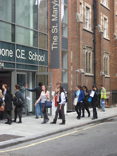
St Marylebone School Cloned

St Marylebone School

Before


This was the original photo of the St Marylebone Sixth Form

After


This is the photo which I had edited. I edited this photo by using the tool button 'Clone Tool.' I first opened this image of St Marylebone Sixth Form. I then clicked on the 'Clone Tool' button, and then held onto the 'alt' button and clicked on whatever I wanted to clone. By doing this, it made the image clear out and duplicate it. As you can see, I have cleared out the St Marylebone Sign on the side, by using the 'Clone Tool.'

Monday 5 October 2009

Photoshop Editing

Before


This was the orginal photo that we, as a group, took of Jade for a magazine cover.

After


This was after we had taken the picture and played around with Adobe Photoshop. In Adobe Photoshop, I did alot of things to create this piece. I first open my image of Jade and edited it. I clicked on the new layer on the left hand side and by using the 'Brush Tool,' I was able to colour Jade in with different colours by changing them at the palette on the right hand side at the bottom. After changing and mixing around with colours, I then clicked on filter at the top toolbar and clicked on 'Gaussian Blur' and changed it to around 30-70 pixels, to make the colours which I choose blend in. Afterwards, I clicked on the left hand side and cahnged to 'Normal' to 'Overlay' to make it more emphasised. This was all down on the same layer which I added in the beginning. To get the picture of Topshop, I went on the internet and copy and pasted it on a new layer. To make the picture more bigger or smaller, I held down the shift button and resized it. I then ticked the tick box on the top toolbar to unblur the picture to make it look more professional and eye-catching. To take away all the white area inside and outside the name (Topshop), I used a tool called the 'Magic Wand' to clicked on the area which I want and then selected delete. Finally, I went onto the top toolbar and clicked on filter, adjustments and invert. I did this so then the picture goes from either black to white, or white to balck.

College Magazine Analysis


College Magazine Analysis

In this powerpoint of College Magazines, I compared 2 magaizine covers. I used the 'College' and 'Walk On' Magazine. In this analysis of comparing both magazines, I labelled the key terms. As well as that, I wrote on each slide of the magazine, key points and what I liked and what I hated about both magazines. In both magazines, there was a difference, as I like the 'College' magazine better than the 'Walk On' magazine due to the colours presented on the main image. I liked the 'College' magazine better as I found it more appealing and simple to look at due to the less colour being used. Whereas, I disliked the 'Walk On' magazine, due to the dark colour represented as the background which made it feel more dull and boring to look at. Each magazine had their own flaws.

Heat Magazine Cover


Heat Magazine Cover

The magazine which I used to label and analyse was the Heat Magazine. In this powerpoint, I labelled the important points of a magazine and analysed it. For this, we have to learn important key terms and conventions of a magazine cover. The masthead, I found that it was the name of the magazine 'Heat.' This masthead was original as well as unique as it stood out and was eye-catching to look at for the readers. In this, there are three main images, which is called 'Triptych,' usually magazines have one main image. Heat has three main images on the cover of the magazine, to make it look more appealing and attracted by this.